For the complete documentation index, see llms.txt. This page is also available as Markdown.

The Graph

The live relationship map: every sphere is a real creator, every line is real engagement Motion scored.
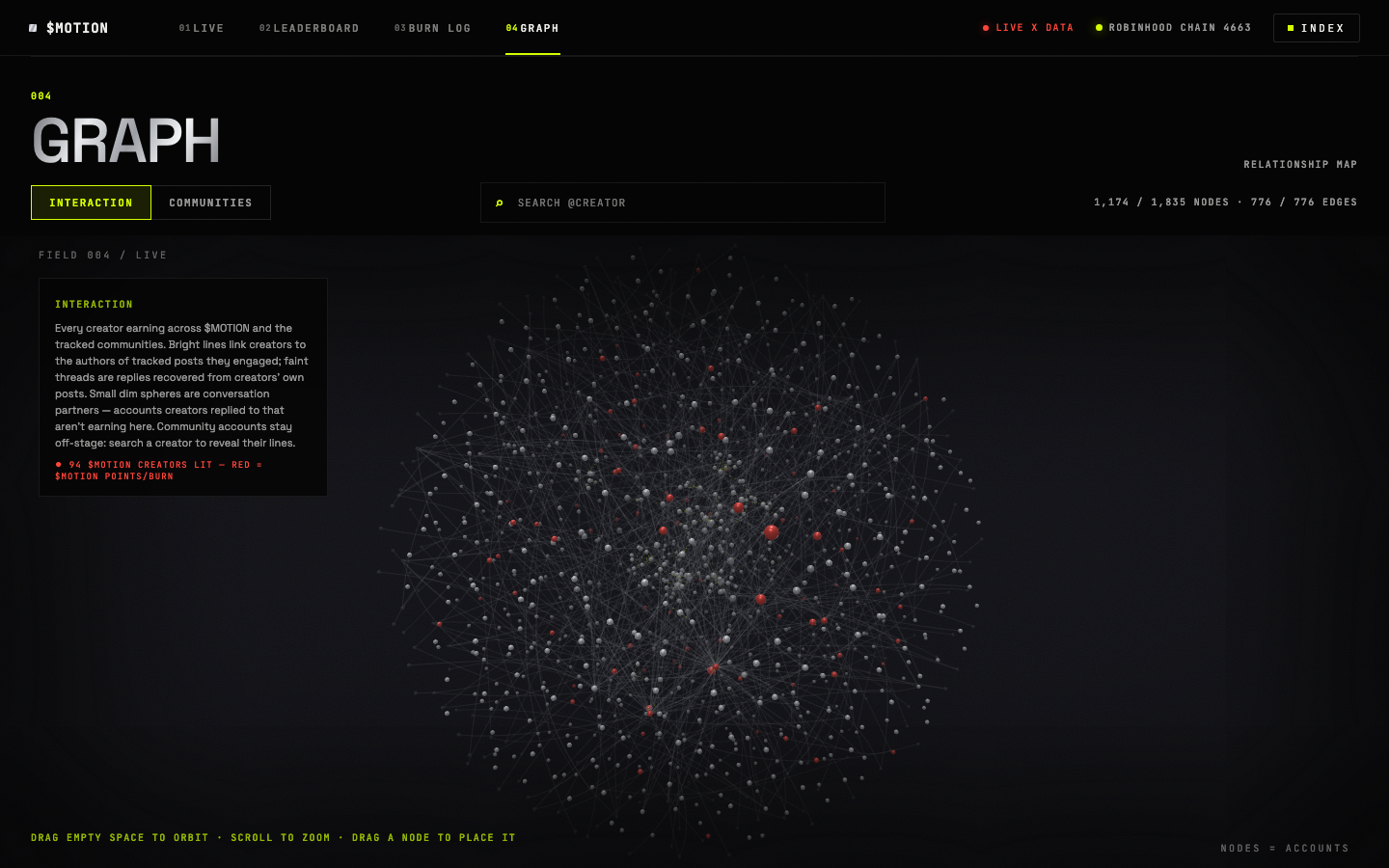
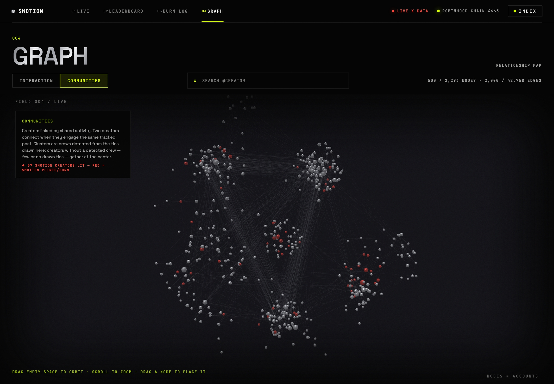
The graph is Motion's live map of the network. Every sphere is a real X account. Every line comes from activity the protocol actually scored, never from follower lists.

The Interaction view: creators sized by the burn credited to each, connected by the engagement Motion scored.

Two views

Interaction shows who's engaging with who. Every line connects a creator to an author they replied to, quoted, or retweeted, and points flow along those lines. This view shows you where the activity in a community actually goes: which creators pull the most engagement, who's driving attention to other people, and who's at the center of the conversation.

The Communities view: creators clustered by the tracked posts they engaged together.

Communities shows the groups. Two creators get linked when they engage the same tracked post, so clusters form around shared bagwork. This view lets you pick out each community's core crew at a glance, the raid team that shows up on every post, and the accounts that are active in more than one community.

Reading the map

Sphere size is the burn credited to that creator, nothing else, not followers, not post count. The colors:

Color
Meaning

Silver

A creator earning on the map

Red

A creator holding $MOTION points or burn

Dim slate

An account that was engaged, but isn't earning here

Lime

Your current selection

Hover to focus a neighborhood, click a sphere for that creator's card (with a link to their leaderboard row), drag to pin, scroll to zoom.

Search your own handle and the camera flies to your sphere. The burn on your card is the same number as your leaderboard row: one figure, seen two ways.

Last updated

Was this helpful?